Canva Designs Look Generic? 12 Pro Customization Tricks to Make Templates Look Custom
By Canva15 min read
To make Canva designs look custom instead of templated, replace default fonts with your brand typefaces, swap stock photos with original images, break the template grid, apply a consistent brand color palette, and remove or reposition signature template elements.
1. Replace Every Default Font With Your Brand Typeface Pair
Canva templates ship with fonts chosen to appeal to the broadest possible audience. That means thousands of users share the same typographic fingerprint. The fix is deliberate and permanent: choose one display font for headlines and one clean sans-serif for body copy, then use that pair on every single design you produce.
Typography pairing is a strategic decision, not a stylistic one. Luxury brands pair wide-tracked serif headlines with minimal body text. Bold consumer brands pair heavy display fonts with tight, punchy subheads. Neither choice is right or wrong. Consistency is everything.
Brand consistency on social media can increase revenue by 10 to 20% (slateteams.com). Typography is one of the primary drivers of that recognition. When your audience sees the same headline font across your social media graphics, pitch deck design, and email header design, they connect the asset to your brand before they read a single word.
How to Upload Custom Fonts in Canva Pro
Navigate to Brand Kit > Fonts > Upload a font to add OTF or TTF files. Upload every weight you use: Regular, Bold, and Italic. Partial font uploads create inconsistency when team members default to system fonts to fill gaps. Once uploaded, set your brand fonts as defaults in the Canva Brand Kit so every new design auto-populates correctly. This removes the temptation to use whatever font the template loaded.
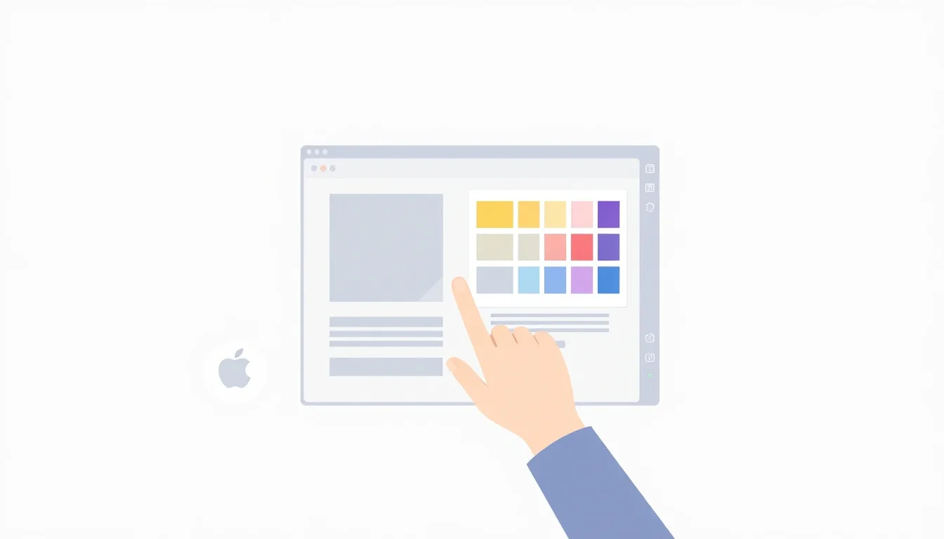
2. Build and Lock a Brand Color Palette, Then Ruthlessly Apply It
The fastest way to identify a templated design is mismatched color. Arbitrary choices that don't reflect a real visual identity signal to every viewer that no one made a deliberate decision.
Build your brand color palette in Canva's Brand Kit with exact hex codes: primary, secondary, accent, and neutral. Then use the global "Edit Colors" recolor tool to swap every template color on the canvas in seconds. Do not go element by element. Do not skip the background.
Limit each design to 3 colors: one dominant, one supporting, one accent. This constraint produces more professional results than most formal design training. It forces hierarchy. It eliminates visual noise. It works.
Using Canva's Brand Kit Color Locking for Team Consistency
Canva's Brand Kit (available on Pro and Teams plans) restricts team members to approved palettes, preventing off-brand color drift when multiple people produce content independently. At Canva, we see this feature eliminate the most common brand consistency failure small teams face: one person using the correct hex codes, and everyone else approximating from memory. Share Brand Kit access with every team member who creates content. Audit your team folder quarterly to catch inconsistencies before they compound across channels.
3. Swap Canva Stock Photos for Original or Curated Brand Images
Stock photos inside Canva templates are used by hundreds of thousands of accounts. They are the single biggest contributor to the "I've seen this before" feeling in small business marketing. Replace them. Full stop.
Original photos don't require a professional shoot. Smartphone images with consistent lighting and intentional framing outperform polished stock photos in authenticity and engagement. A real product on a clean surface beats a generic lifestyle image every time.
If original photos aren't available, source from Unsplash or Pexels and apply a consistent treatment to unify them (see trick #4). The key is consistent framing and deliberate focal point choices using Canva's cropping tools. Center-cropped squares are a template default. Dynamic, off-center crops are a design choice.
For product-based businesses, professional photography costs vary widely. White-background product shots start at $35 per image (pixelphant.com), while lifestyle and creative images start at $375 per image (pixelphant.com). For many small businesses, smartphone originals combined with smart Canva treatment close that gap at near-zero cost.
Creating Visual Cohesion Across Mixed Photo Sources
Apply identical filter or duotone treatment to every photo in a campaign. This unifies images from different sources into a single visual language. Maintain consistent subject framing and negative space to create a recognizable rhythm. Build a dedicated Canva folder for approved brand photos so team members always pull from the right library, not from a search result.
4. Apply a Signature Photo Treatment or Duotone Effect
A consistent image treatment transforms any photo into a branded asset. Apply it identically across every image in a campaign or channel.
Repetition creates the signature. Audiences begin to recognize your visual style before they consciously identify your brand name. That subliminal recognition is worth more than any single clever graphic.
In Canva, use the "Edit Image" panel to apply filters and adjust brightness, contrast, and saturation uniformly. For brand-color tints, overlay a semi-transparent rectangle in your brand color at low opacity. Duotone treatments are particularly effective because they simultaneously unify imagery and reinforce your brand color palette. Two birds. One edit.
5. Break the Template Grid by Repositioning Key Elements
Templates default to safe, centered, symmetrical layouts. The trained eye spots them immediately. Breaking the grid is the fastest signal that a human made a considered design decision rather than accepting defaults.
Move text blocks off-center. Extend an image to bleed past its original boundary. Rotate a background shape 3 to 5 degrees to introduce unexpected tension. Overlap elements so text sits over an image, a shape tucks behind a photo, or an icon bridges two content zones. Flat, default layouts never achieve the depth that overlapping creates.
The risk is making asymmetry look accidental. Use Canva's ruler guides and Position panel to set precise X/Y coordinates for elements placed outside the default grid. Align off-center elements to each other rather than to the page center. Group related elements before repositioning so complex compositions move as a single unit. Intentional asymmetry reads as design. Careless asymmetry reads as a mistake.
6. Delete or Redesign Template Signature Elements
Every popular Canva template has 1 to 3 signature elements: a distinctive divider line, an icon cluster, a background texture shape, or a specific corner treatment. These elements make it immediately recognizable to anyone who has browsed the template library.
Identify them. Then delete or transform them.
Replacing Canva's default icons with custom icons from Noun Project, Flaticon, or your own brand icon set eliminates one of the most common template tells. Altering a signature shape's color, size, and position so dramatically it no longer reads as the original element achieves the same result without deletion. This step requires design confidence but delivers the highest return. Remove three signature elements and a recognizable template becomes completely unidentifiable as Canva output.
7. Add Custom Text Effects: Shadows, Outlines, and Spacing
Default Canva typography is flat, evenly spaced, and sized to fit the template container. These are hallmarks of untouched template text. Break each one.
Adjust letter spacing (tracking) on headlines deliberately. Luxury brands use wide tracking (+50 to +200). Bold brands use tight tracking (-20 to -50). Choose one direction and apply it consistently across all your marketing templates. Apply text shadow or lift effects sparingly: one element with a shadow in a composition, not every line. Use a 3:1 or 4:1 size ratio between headline and subheading to build hierarchy that flat, template-default sizing never achieves.
These are not decorative decisions. Typography hierarchy controls where the reader's eye goes first, second, and third. That sequence is where persuasion happens in social media graphics and ads.
8. Use Canva's Background Remover to Integrate Real Product or People Photos
Placing a cutout product or person against a solid brand-color or textured background creates a custom composition no template replicates. Canva Pro's background remover processes images in seconds.
Use it on product photos, team headshots, or illustrated elements to isolate subjects for flexible placement. Layer the cutout over gradients, brand-color solids, or subtle pattern backgrounds uploaded as brand assets. The compositions you can build this way exist nowhere in Canva's public template library.
Consider a concrete example: a boutique skincare brand wants to announce a new product on Instagram. Instead of dropping the product into a template lifestyle scene, they remove the background from a clean product shot, place it over a textured background in their brand's sage green, and add their display font headline at a 4:1 size ratio. The result is a branded asset that matches their visual identity exactly and uses no stock photography whatsoever.
Results speak louder. That approach takes under 10 minutes in Canva. It's also not replicable by any competitor using the same template.
9. Create and Reuse a Custom Frame or Border System
A consistent frame or container style across all designs functions like a visual brand signature. It ties disparate content types together without requiring identical layouts.
Design a simple custom frame in Canva: a specific stroke weight, corner style, and brand color. Save it as a component in your Brand Templates for reuse across your team. Options include thin-line geometric frames, rounded-corner photo containers, asymmetric crop shapes, or layered offset borders using two brand colors. One frame system can unify social posts, pitch deck design, email header design, and ad creative into a visually coherent brand family across every channel.
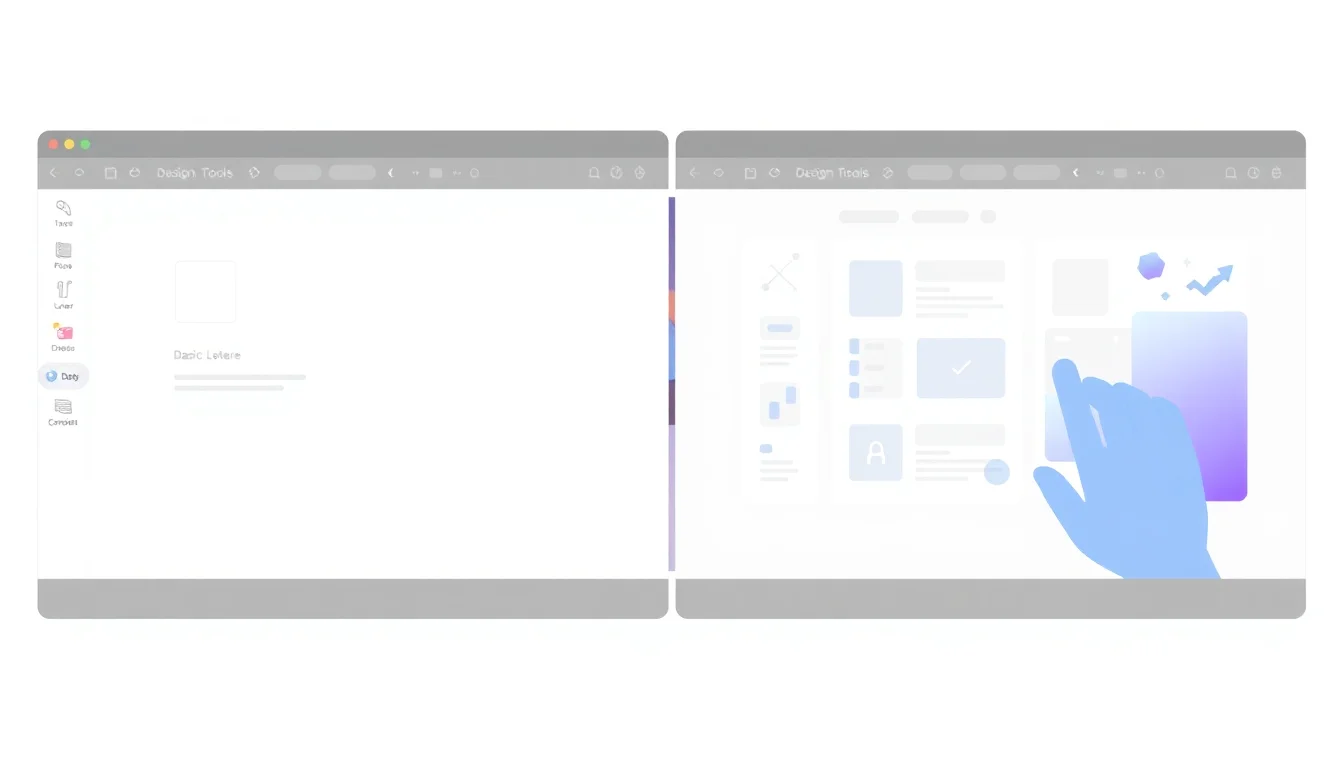
10. Build Branded Templates From Scratch and Lock Them for Your Team
The most reliable way to stop looking templated is to stop starting from Canva's public template library. Build your own master templates for every recurring content format.
Create blank-canvas designs for each format using only your brand fonts, colors, and asset library. Publish them as Brand Templates (Pro and Teams plans) where team members can edit designated content zones but cannot alter fonts, colors, or layout structure. This approach eliminates the generic look and solves the brand consistency problem that plagues teams where multiple people create content independently.
Which Content Formats to Templatize First
Prioritize high-frequency formats: social media graphics, email headers, and presentation title slides produce the highest return on template investment. Build announcement, promotional, and educational variants for each format so teams have flexibility without starting from scratch. Write a one-page template usage guide so new team members adopt the system correctly from their first day. This is where content creation becomes a scalable system rather than a repeated fire drill.
11. Use Texture, Grain, and Pattern Overlays to Add Visual Depth
Flat digital designs look machine-made. Texture signals craft. Adding subtle overlays: paper grain, linen, noise, or halftone patterns introduces an organic quality that communicates intentionality.
Upload brand-matched texture files as PNG overlays sourced from Creative Market or generated with AI tools. The effect is subliminal: viewers cannot articulate why a design feels more premium, but the texture is doing the work. Alternatively, use Canva's built-in gradient mesh backgrounds and halftone patterns, but recolor them to your exact brand palette rather than using them as-is. Using them at their defaults makes them recognizable as Canva elements again, which defeats the purpose.
Texture is one of the clearest differentiators between template output and considered design. Use it.
12. Establish a Visual Rhythm With Consistent Spacing and Margin Rules
Amateur and templated designs share a common flaw: inconsistent spacing. Elements crowded in some areas, isolated in others, with no underlying logic tying the layout together.
Choose a base spacing unit: 16px or 24px work well. Make all padding, margins, and element gaps multiples of that unit. This creates visual harmony that feels professional even when you cannot explain why. In Canva, use Smart Guides and the Align and Distribute panel to equalize gaps between elements. Set a consistent safe-zone margin of at least 40 to 60px on all sides and never violate it.
This matters more than most designers admit. Spacing inconsistency is the most common reason a technically correct design still looks "off" to the eye.
Quick Canva Spacing Audit for Existing Designs
Open any existing design and enable Smart Guides from the View menu to reveal current spacing inconsistencies. Use the Align and Distribute panel to equalize spacing between all similar elements in one click. Inconsistent margins are the most commonly missed spacing error in non-designer content production workflow, and they are completely fixable in under two minutes.
Frequently Asked Questions
Can you make Canva designs look professional without a Canva Pro subscription?
Yes. The free tier allows font selection from Canva's library, color customization, element repositioning, and grid-breaking techniques. Pro features like Brand Kit, custom font uploads, and the background remover accelerate the process. The most impactful changes — replacing photos, breaking the grid, deleting template signatures — require no paid features at all.
How do I stop my Canva designs from looking like everyone else's when we're using the same templates?
Identify and remove the 1 to 3 signature elements that make a template instantly recognizable: its distinctive divider, icon cluster, or background shape. Replace template stock photos with original images. Apply your brand font pair and exact hex codes. After those three moves, the original template is no longer identifiable. The starting point becomes irrelevant.
What is the Canva Brand Kit and do I need it to maintain brand consistency?
The Canva Brand Kit (Pro and Teams) stores your exact brand fonts, hex color codes, and logo files, and auto-applies them to new designs. Without it, each team member manually enters brand colors and selects fonts independently, which creates drift. For teams with more than one content creator, Brand Kit is not optional if brand consistency is a goal.
How do I upload my own fonts to Canva?
Canva Pro users can upload custom fonts by navigating to Brand Kit > Fonts > Upload a font. Accepted formats are OTF and TTF. Upload every weight you use: Regular, Bold, Italic, and Bold Italic. Set uploaded fonts as brand defaults so all new designs start with the correct typeface pair and team members never default to system fonts to fill gaps.
Can Canva designs meet the resolution and file format requirements for print materials and paid ads?
Canva supports PNG export up to 4x resolution, PDF print output, and CMYK PDF files on Pro. For standard digital ads and most print formats, Canva's output quality is sufficient. Check platform-specific requirements before exporting: Meta ads require minimum 1080x1080px, while some print vendors require 300dpi CMYK PDFs, which Canva Pro supports natively.
How do I share locked branded templates with my team in Canva so they can't break the design?
Use Canva's Brand Templates feature, available on Pro and Teams plans. Build your master design, then publish it to your team's Brand Templates folder. Team members can edit text and designated image zones but cannot alter fonts, colors, or layout structure. This separates content production from design decisions, which is the foundation of any scalable content production workflow.
What are some tips to make Canva designs look more unique
Replace every default font with your own brand typeface pair. Swap all stock photos for original or curated images with a consistent treatment applied. Delete the 1 to 3 signature elements that identify the template. Apply a consistent spacing system with a base unit of 16px or 24px. Add a subtle texture overlay at 5 to 15% opacity. These five changes make any Canva template unrecognizable as one.
How can I customize Canva templates without losing their professional look
The professional structure of a Canva template lives in its spacing, hierarchy, and layout logic, not in its colors, fonts, or photos. Preserve the layout structure while replacing every surface-level element: colors, fonts, images, and signature shapes. Use alignment tools and Smart Guides to maintain spacing precision during edits. The template's underlying grid keeps the design grounded while your brand elements make it original.
Are there specific design elements in Canva that can help avoid a generic look
Yes. Canva's Background Remover creates custom product and people cutouts unavailable in any template. The Position panel enables precise off-center element placement for intentional asymmetry. Brand Kit enforces visual identity across every design. Uploading custom textures as PNG overlays adds depth that no template provides. Combining these three features produces output that reads as custom design, not template output.
How do I choose the right color palette in Canva to make my designs stand out
Start with your existing brand colors. If none exist, choose one dominant color that reflects your brand personality, one supporting neutral, and one accent that creates contrast. Enter exact hex codes in Canva's Brand Kit to lock them in. Limit each individual design to 3 colors maximum. Fewer colors create more confident, professional results than trying to use an entire palette in every asset.
What are some advanced techniques for editing Canva templates
Advanced techniques include: using the Position panel's X/Y coordinates for precise off-grid element placement; applying duotone treatments using brand colors over all photos; uploading PNG texture overlays at 5 to 15% opacity for depth; building master branded templates with locked zones for team use; and using the global Edit Colors tool to recolor an entire template's palette in seconds rather than editing element by element.
Sources & References
About the Author
Canva
Canva enables non-designers to create professional marketing assets instantly. The platform removes barriers to quality design for small businesses and startups without requiring skills, software, or agency costs.
Related Posts
How to Make a Pitch Deck Without a Designer: A Step-by-Step Guide
You don't need a designer or expensive software to build a pitch deck that wins investors. This step-by-step guide shows founders and small business owners how to create a professional, compelling pitch deck using accessible tools — in a single afternoon.
17 min read
Canva vs. Adobe Express in 2026: The Honest Comparison for Non-Designers
Both Canva and Adobe Express promise to make design effortless for non-designers — but they take very different approaches. This honest comparison breaks down templates, AI features, brand controls, and pricing so small business owners and marketers can choose the tool that actually fits how they work.
17 min read
Canva Free vs. Canva Pro in 2026: Every Difference That Actually Matters for Small Businesses
Canva Free is surprisingly capable, but Pro unlocks the brand consistency and automation features that turn it from a design tool into a marketing engine. This feature-by-feature breakdown helps small business owners decide whether the $15/month upgrade pays for itself — before they hit a paywall mid-project.
14 min read