Design Psychology 101 for Marketers: 10 Principles That Make Your Visuals Convert
By Canva15 min read
Here is the full updated markdown with internal links inserted:
Design psychology basics for marketers include contrast, color emotion, visual hierarchy, the rule of thirds, white space, social proof cues, the Von Restorff effect, Gestalt principles, font psychology, and F-pattern layout. Applying even three of these principles to your next social post, ad, or landing page can measurably improve click-through and conversion rates.
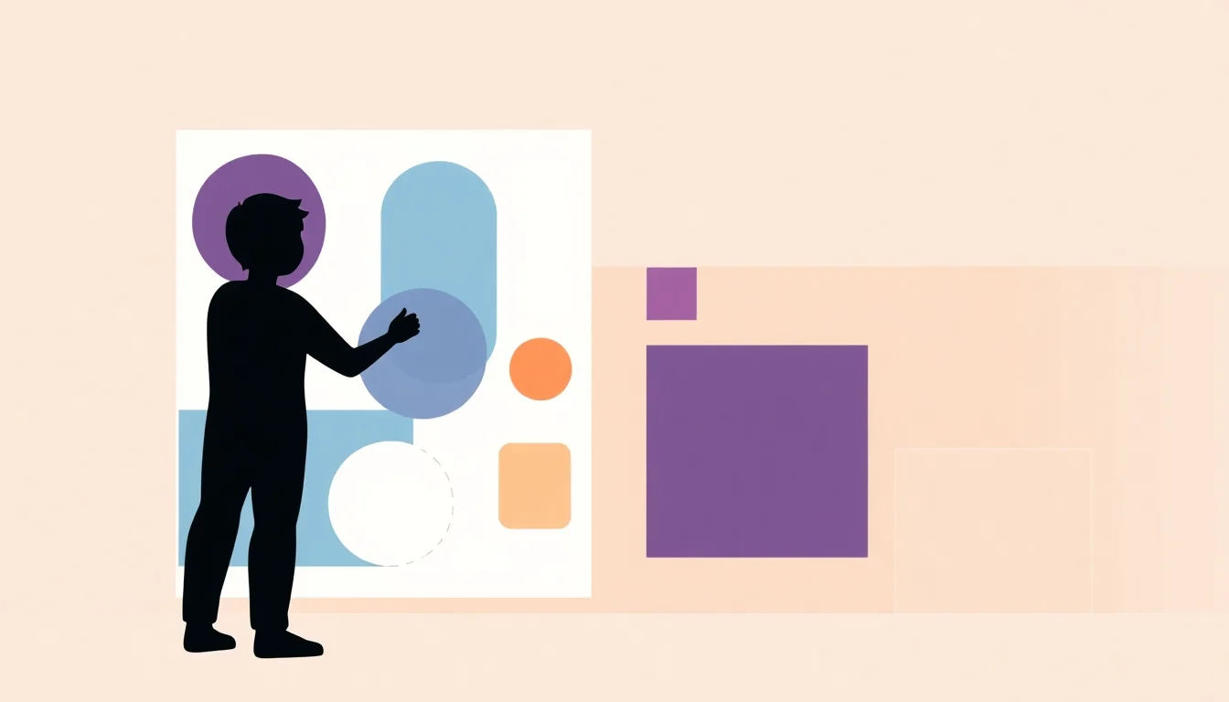
1. Visual Hierarchy: Guide Your Audience's Eyes to What Matters Most
Visual hierarchy controls the order in which viewers process information by manipulating size, weight, and position. Your brain scans a design in milliseconds, and hierarchy is what decides where it lands first. When every element competes at the same size and weight, cognitive overload sets in and conversions drop.
The rule is simple. One primary message per design. Make it visually dominant, largest, boldest, highest on the page, and let everything else support it. This is the backbone of effective visual hierarchy in marketing design.
How to Apply Visual Hierarchy Without Design Software
Use aggressive font size contrast: a 48pt headline against 16pt body text creates immediate dominance without any design training. Place your primary CTA in the upper-center or lower-center zone, which eye-tracking data consistently identifies as the two highest-attention areas. Limit yourself to three hierarchy levels, primary, secondary, and supporting, and never blur the line between them. At Canva, we see non-designers produce sharper, more professional assets the moment they commit to this three-level rule and stop treating every line of copy as equally important.
2. Color Psychology: Trigger the Right Emotional Response Before Anyone Reads a Word
Color communicates emotion before copy is ever processed. This isn't metaphor. It's behavioral psychology. Color signals reach the limbic system, the brain's emotional center, faster than language comprehension kicks in. Blue signals trust and reliability, which is why 23% of the top 100 brands in the world use blue in their logo (designrush.com). Red drives urgency and appetite. Green signals growth, safety, or environmental values.
The deeper issue with color psychology is that most discussions stay generic. The real trade-off is this: choosing a color based on personal preference rather than customer emotion costs you conversions at the subconscious level. Purchasing decisions are heavily driven by color, not because customers think about it, but precisely because they don't. The emotional signal fires before the rational mind engages.
Brand color consistency matters just as much as initial color choice. Inconsistent designs trigger subconscious uncertainty and avoidance. When a prospect sees your Facebook ad in one color palette and lands on a landing page in a different one, trust erodes before they read a single headline. Brand consistency is not an aesthetic preference. It's a conversion lever.
The 60-30-10 Color Rule for Non-Designers
Use 60% (designrush.com) dominant brand color, 30% secondary color, and 10% accent for CTAs. This ratio prevents visual chaos and creates a professional, intentional look instantly. Reserve your highest-contrast accent color exclusively for buttons and conversion elements. Never dilute it by using it decoratively, the moment it appears everywhere, it stops commanding attention anywhere.
3. Contrast: The Single Most Powerful Tool for Driving Attention to Your CTA
Contrast in color, size, shape, or texture is what makes one element stand out from everything else. A CTA button that doesn't contrast sharply with its background is invisible to a scanning eye. This is not an exaggeration.
The Web Content Accessibility Guidelines (WCAG) require a minimum 4.5:1 contrast ratio for text (w3.org). Meeting this standard improves accessibility and conversion simultaneously, these goals are not in conflict. In A/B testing across digital advertising, high-contrast CTA buttons consistently outperform low-contrast variations because the design does the attention work before the copy does the persuasion work.
The practical test: squint at your design until it blurs. If your CTA doesn't still visually pop, it needs more contrast. No design tool required. Just your eyes.
4. The Von Restorff Effect: Make One Element Impossible to Ignore
The Von Restorff effect, also called the isolation effect, states that an item standing out from its surroundings is significantly more likely to be remembered and acted on. Consumers encounter over 5,000 marketing messages daily (linkedin.com). Most are forgotten within seconds. The Von Restorff effect is how you escape that fate.
In practical terms, this means deliberately breaking a visual pattern at exactly one point in your design. A row of gray pricing plan cards with one highlighted in bold color. A testimonial grid where one quote appears in oversized type. A "Most Popular" badge that sits above the fold in a contrasting shape. These aren't decorative choices. They are strategic pattern interruptions that direct memory and action.
Design your layouts with visual consistency everywhere except the single element you most need people to notice. One interruption amplifies. Multiple interruptions cancel each other out and return you to visual noise.
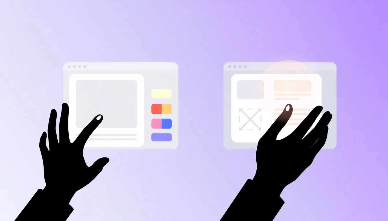
5. White Space: Why Giving Your Design Room to Breathe Increases Conversions
White space, the empty area surrounding design elements, is not wasted space. It is a tool. Specifically, it is a cognitive load reduction tool.
White space activates what behavioral psychologists call System 1 thinking, the fast, intuitive processing mode, before rational evaluation begins. When a design is cluttered, the brain shifts to effortful System 2 processing just to parse the layout. That cognitive friction translates directly to bounce rates and abandoned funnels.
Premium brands use generous white space to signal quality and calm confidence. Think of a luxury product landing page versus a discount retail flyer. The difference in white space is the difference in perceived brand value, independent of the product itself. When your design feels empty, resist the urge to fill it. That space is reducing cognitive load and elevating perceived quality simultaneously. These are two of the most valuable things any design can do for a small business marketing on a tight budget.
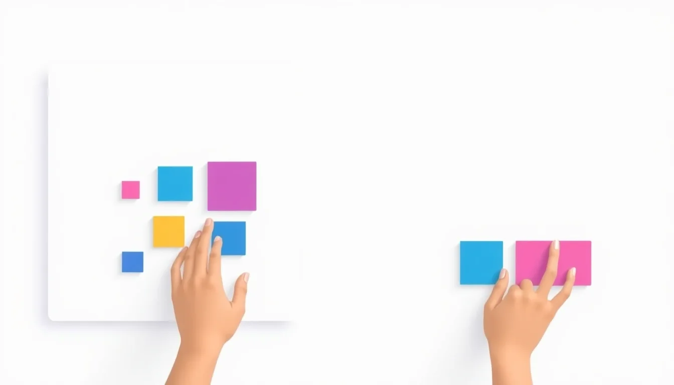
6. Gestalt Principles: How the Brain Groups Visual Information Automatically
Gestalt psychology explains that the human brain instinctively organizes visual elements into groups, patterns, and wholes. The four most marketing-relevant principles are proximity, similarity, continuity, and closure.
Proximity is why placing your logo next to your tagline creates association. Similarity is why using consistent icon styles across a social media post series makes the series feel cohesive rather than random. Continuity explains why a person's gaze in a photo, pointed toward your CTA, quietly pulls viewer attention in that direction. Closure explains why incomplete shapes (a circle with a gap, a logo built from negative space) still register as complete.
Applying Gestalt to Social Media Post Design
Cluster your logo, brand name, and website URL together. Proximity builds a unified brand identity block that registers as one unit. Use consistent icon styles and color tones across a post series to trigger similarity recognition, viewers start to recognize your brand before they consciously identify it. Add directional cues such as arrows or a subject's eyeline to activate continuity and drive eyes toward your CTA. These design principles work together across every piece of content creation your team produces.
7. Font Psychology: Your Typography Is Sending a Message Before Anyone Reads It
Typeface choice communicates personality and credibility before a single word is consciously read. This is not a soft creative claim, research from Monotype shows that typeface choices can increase positive consumer responses by up to 13% (crisiscommunications.com), demonstrating typography's measurable impact on brand perception.
Serif fonts signal tradition, authority, and trustworthiness. Sans-serif fonts signal modernity and approachability. Script fonts signal creativity but destroy readability at small sizes, particularly critical given that 68% of font perception survey respondents viewed content on a mobile phone (typetasting.com), where small fonts collapse entirely.
Font pairing, a bold display font for headlines with a clean sans-serif for body copy, creates visual contrast while maintaining cohesion. Never use more than two font families in a single design. Ensure they contrast in weight or style, not just family name. Two thin fonts or two heavy fonts create tension without hierarchy, which is the worst of both worlds.
This is where many non-designer marketers unknowingly undermine their brand identity. A mismatched typeface on a pitch deck or ad creative signals amateurism before the audience processes a single claim. Typography is graphic design basics that pays outsized dividends.
8. The F-Pattern and Z-Pattern: Design Layouts That Match How People Actually Read
Industry data suggests users scan web pages and ads in predictable F-shaped or Z-shaped patterns, not word by word, not top-to-bottom, and not centered. This changes everything about where you place critical information.
The F-pattern dominates text-heavy content. Users read the first line in full, then scan left margins for hooks, and rarely reach the right side of the page at all. The Z-pattern dominates sparse visual layouts like ads and landing page heroes: top-left to top-right, then diagonal to bottom-left, then across to bottom-right.
For social media design and display ads, the Z-pattern is your guide. Place your brand or logo top-left. Put the key visual top-right. Supporting information goes bottom-left. Your CTA goes bottom-right, where the eye naturally ends the scan. Stop placing critical information at center-bottom. That is the last place a scanning eye lands in a Z-pattern layout, and in an F-pattern layout, it may never land there at all.
9. Social Proof Visual Cues: Design Elements That Signal Trustworthiness
Social proof is not just a copywriting tactic. It is a design principle. Visual social proof elements, star ratings, review counts, recognizable customer logos, press badges, and testimonial portraits, trigger trust responses before the rational mind evaluates the claim.
Faces accelerate this effect. The human brain is neurologically wired to process faces faster than any other image type. A real customer photo next to a testimonial outperforms the same testimonial in a text block because the face activates trust processing immediately. Logos work similarly, 90% of consumers are willing to pay more for brands they trust (designrush.com), and familiar brand associations in your design borrow that trust equity.
Consider a concrete scenario: a solopreneur running Facebook ads for a coaching service adds a headshot testimonial with a five-star rating in the lower-left zone of a Z-pattern ad layout. The social proof cue appears exactly where the eye lands mid-scan, and the star rating registers before the quote is read. That sequencing is intentional design, not accident.
Include at least one trust signal, a recognizable logo, a star rating, or a real customer photo, in every bottom-of-funnel visual asset. No exceptions.
10. The Rule of Thirds: A Foolproof Composition Framework for Non-Designers
The rule of thirds divides any design into a 3×3 grid. The four intersection points of that grid are where the human eye naturally focuses first. Placing your focal point, a product, face, headline, or CTA, at one of these four "power points" creates instantly more compelling, professional-feeling compositions.
Photographers, filmmakers, and graphic designers use this framework universally because it exploits natural visual attention patterns. It works in social media posts, display ads, email headers, and pitch deck slides. The principle is platform-agnostic.
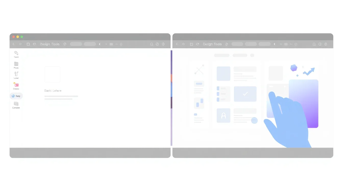
Using Built-in Grid Tools to Apply the Rule of Thirds Instantly
Most modern design tools include grid overlays or alignment guides. Enable grid view before placing any element in a new design, this single habit prevents the "everything centered" default that makes amateur designs feel flat and forgettable. Asymmetric layouts built on the rule of thirds consistently outperform centered compositions in conversion rate optimization A/B tests because asymmetry creates visual tension that holds attention, while perfect center alignment resolves immediately and is forgotten just as fast.
Before finalizing any design, mentally overlay a 3×3 grid. Ask whether your most important element sits at or near one of the four intersection points. If it doesn't, move it. That one adjustment often transforms a flat design into a composition that feels professionally crafted, even when built entirely from design templates by a non-designer with no formal training.
Frequently Asked Questions
Do I need design experience to apply design psychology principles to my marketing visuals?
No design experience is required. Principles like visual hierarchy, white space, the rule of thirds, and the 60-30-10 color rule are frameworks, not skills. Any marketer can apply them using modern design tools with built-in grids and templates. Understanding why these principles work accelerates your results far more than software proficiency alone.
Which design psychology principle has the biggest impact on conversion rates for social media ads?
Contrast drives the most immediate CTA performance in social media ads. A high-contrast button that visually pops against its background captures attention during fast scrolling. Pair contrast with the Z-pattern layout, placing your CTA at the bottom-right endpoint of the natural scan path, and you compound the effect significantly across most ad formats.
How do I choose the right colors for my brand if I don't have a background in design?
Start with the emotion you want customers to feel, not colors you personally prefer. Blue builds trust, red creates urgency, green signals growth or sustainability. Then apply the 60-30-10 rule: 60% dominant brand color, 30% secondary, 10% high-contrast accent reserved exclusively for CTAs. Keep this palette consistent across every marketing touchpoint without exception.
Can applying design psychology principles make my designs look less generic or templated?
Absolutely. Generic designs fail because they apply no intentional psychology — everything is the same size, the same weight, and centered by default. Applying visual hierarchy, the Von Restorff effect, and the rule of thirds immediately creates visual tension and intentionality that makes a design feel crafted. The template is the starting point, not the finished product. Principle application is what differentiates your output.
How many design psychology principles should I try to apply in a single piece of marketing content?
Three to five principles work well together in a single design without creating conflicting signals. Start with visual hierarchy to establish structure, add contrast to isolate your CTA, and apply one composition framework like the rule of thirds. Layer in color psychology and a Gestalt grouping principle once the foundation is solid. Trying to apply all ten simultaneously creates confusion, not clarity.
What is the fastest design psychology win for a small business owner with no design budget?
Apply the contrast principle to your CTA immediately. Find your current button or link, check whether it visually pops when you squint at the design, and increase the color contrast until it does. This single change requires no budget, no design skills, and no new tools — and it directly impacts the element most responsible for driving measurable conversion results.
How can symmetry in design influence consumer trust?
Symmetry signals stability, order, and professionalism to the brain because humans associate balanced compositions with safety and reliability. Brands using symmetrical layouts in logos and landing pages benefit from this subconscious association. Asymmetry creates energy and tension, which works for CTAs, but symmetry in overall brand structure builds the foundational trust that keeps customers returning across repeated touchpoints.
What role does color play in shaping brand perception?
Color shapes brand perception before any copy is read by triggering emotional associations at a subconscious level. Blue signals trust and stability, which explains why 23% of the top 100 global brands use it ([designrush.com](https://www.designrush.com/agency/logo-branding/trends/branding-statistics)). Consistent color use across all brand touchpoints builds recognition and trust over time, while inconsistent color use creates confusion and erodes perceived professionalism.
How does consistency in visual design create psychological safety?
Consistent visual design creates psychological safety by eliminating cognitive surprise. When every touchpoint — ads, emails, website, social posts — shares the same color palette, typography, and layout logic, the brain categorizes the brand as familiar and reliable. Inconsistency triggers subconscious uncertainty and avoidance. Customers don't articulate this discomfort; they simply disengage. Brand consistency is a trust mechanism, not merely an aesthetic standard.
What are some examples of motion design that enhance user experience?
Subtle micro-interactions are the most effective motion design for user experience. A button that slightly scales on hover, a loading animation that signals progress, or a menu that slides in with a soft ease — these small moments reduce uncertainty and reward interaction. The peak-end rule in psychology suggests users remember the most intense positive moment and the final moment of an experience, so motion that creates a satisfying micro-moment at the point of conversion leaves a disproportionately strong positive impression.
How can graphic design principles improve brand recognition?
Graphic design principles like visual hierarchy, consistent color use, and proximity directly improve brand recognition by training audiences to identify your brand before they consciously process it. Consistent application of these principles across all marketing visuals creates a visual signature. Over time, 60% of consumers avoid brands with unappealing logos even if reviews are strong ([designrush.com](https://www.designrush.com/agency/logo-branding/trends/branding-statistics)), confirming that design quality is a brand survival factor, not a luxury.
Sources & References
- Web Content Accessibility Guidelines (WCAG)[org]
- The Psychology of Font Choice and Brand Personality[industry]
- The Ultimate Font Face-Off: Serif vs Sans Serif in the Psychological Battle of Font Personalities[industry]
- Must-Know Branding Statistics for 2026 to Boost Recognition[industry]
- Harnessing the Von Restorff Effect: A Powerful Tool for Marketers[industry]
About the Author
Canva
Canva enables non-designers to create professional marketing assets instantly. The platform removes barriers to quality design for small businesses and startups without requiring skills, software, or agency costs.
Related Posts
How to Make a Pitch Deck Without a Designer: A Step-by-Step Guide
You don't need a designer or expensive software to build a pitch deck that wins investors. This step-by-step guide shows founders and small business owners how to create a professional, compelling pitch deck using accessible tools — in a single afternoon.
17 min read
Canva vs. Adobe Express in 2026: The Honest Comparison for Non-Designers
Both Canva and Adobe Express promise to make design effortless for non-designers — but they take very different approaches. This honest comparison breaks down templates, AI features, brand controls, and pricing so small business owners and marketers can choose the tool that actually fits how they work.
17 min read
Canva Free vs. Canva Pro in 2026: Every Difference That Actually Matters for Small Businesses
Canva Free is surprisingly capable, but Pro unlocks the brand consistency and automation features that turn it from a design tool into a marketing engine. This feature-by-feature breakdown helps small business owners decide whether the $15/month upgrade pays for itself — before they hit a paywall mid-project.
14 min read